Seronova
BRAND DESIGN | ART DIRECTION | BRAND STRATEGY
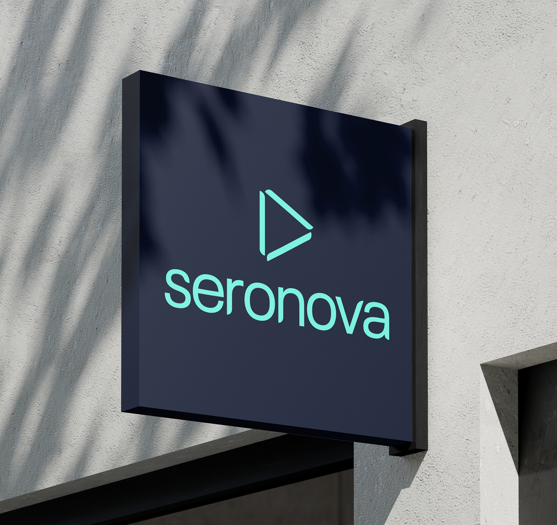
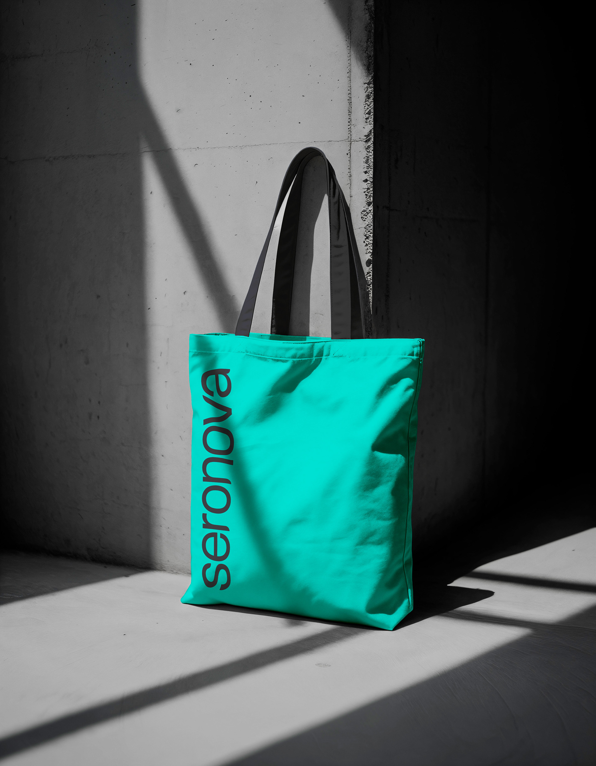
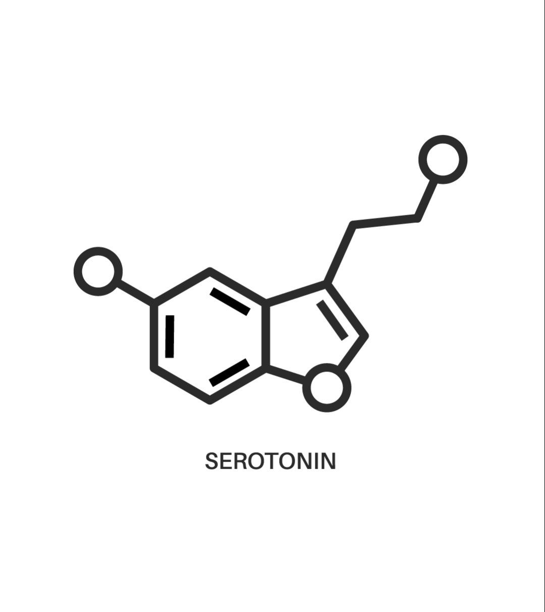
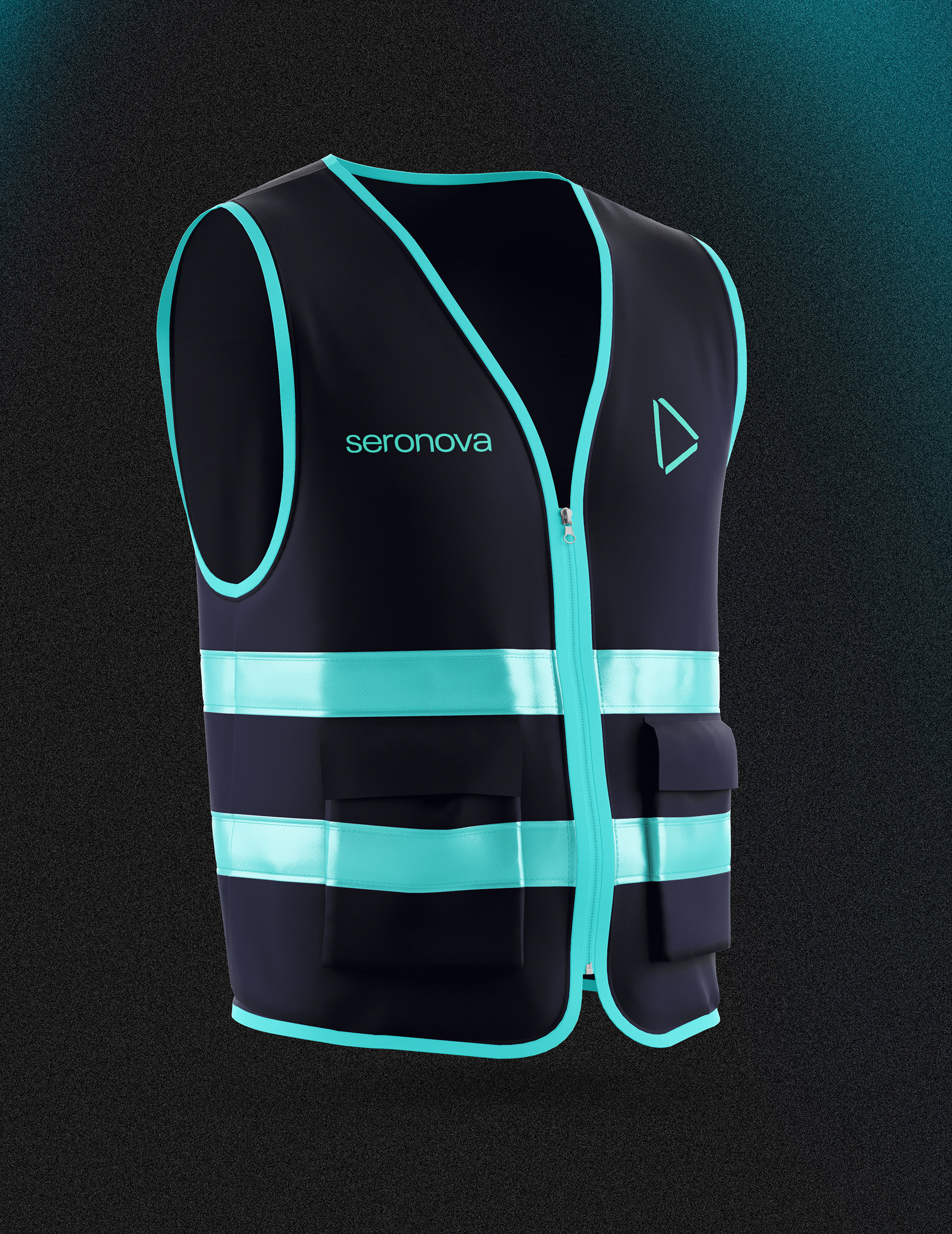
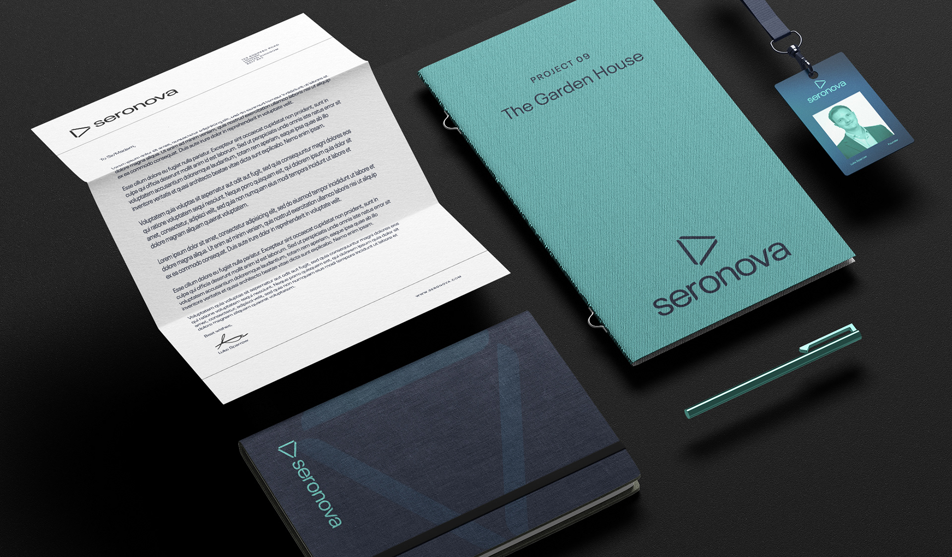
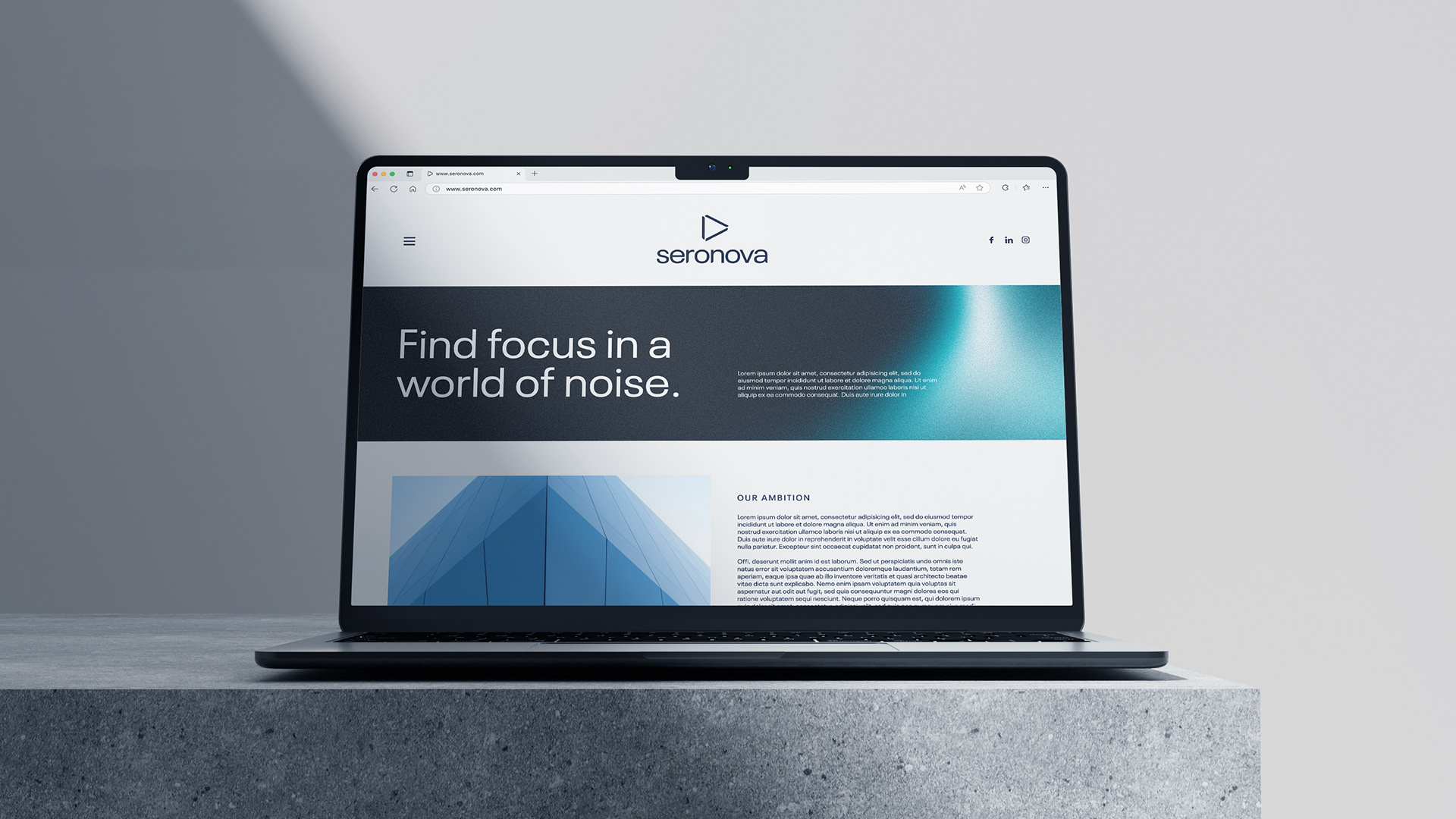
Seronova is a brand identity designed to bring clarity and calm to an often cluttered sustainability landscape. Rooted in the creative direction Clear Path, the brand positions Seronova as making sustainability feel simple, human, and quietly inspiring. The name blends sero (serotonin) with nova (newness and renewal), while the icon reimagines the serotonin molecule as a symbol of progress and forward movement, offering a visual metaphor for finding calm within complexity.
My role was as a strategic designer, building the brand from the ground up in close collaboration with the founder and strategist. I helped shape the identity from its naming and core meaning through to the full visual system, ensuring every element remained true to the brand’s purpose. The focus was on creating a considered brand that felt both meaningful and enduring, with a strong sense of direction at its core.
CLIENT:
Seronova
Agency:
Freelance commission
Role:
Brand Designer, Art Director, Motion Designer